
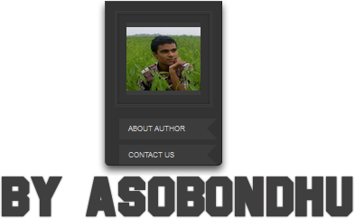
বন্ধুরা সবাই ক্যামন আছেন ভালতো আজে আমি আপনাদের জন্য নিয়ে এলাম একটি ভিন্ন ধরনের লেখক পরিচিতি বক্স মানে Author বক্স । এটা দেখতে খুবি সুন্দর এবং একটা স্লাইড করবে । তাই এটাকে দেখতে আরও সুন্দর দ্যাখাবে । তাহলে নীচে ডেমো তে ক্লিক করে এর ডেমো দেখে নিন ।

দেখে নিন কিভাবে আপনার ব্লগে যুক্ত করবেন :
1. আপনার ব্লগার ব্লগ ড্যাশবোর্ড এ যান তারপর Layout এ ক্লিক করুন ।
২. এবার Add a Gadget এ ক্লিক করে HTML/JavaScript করুন ।
3. এবার Content ঘরে নীচের কোডটি কপি করে পেস্ট করুন ।
<style>
#BloggerSpiceRibbonAuthorBox {
position: absolute;
top: 30px;right: 32%;
z-index: 10;
width: 108px;
height: 160px;
background-color: #333;
color: #999;
-webkit-box-shadow: 0 5px 7px rgba(0,0,0,.7);
-moz-box-shadow: 0 5px 7px rgba(0,0,0,.7);
box-shadow: 0 5px 7px rgba(0,0,0,.7);
-webkit-border-radius: 0 0 5px 5px;
-moz-border-radius: 0 0 5px 5px;
border-radius: 0 0 5px 5px;
-webkit-transition: right 5.15s linear;
-moz-transition: right 5.15s linear;
-ms-transition: right 5.15s linear;
-o-transition: right 5.15s linear;
transition: right 5.15s linear;
border: 1px solid;
border-color: #444 #222 #222 #444;
padding: 10px;
-webkit-transition: all 7s ease-out;
-moz-transition: all 4.26s ease-out;
-ms-transition: all 7s ease-out;
-o-transition: all 4.26s ease-out;
transition: all 7s ease-out;
}
#BloggerSpiceRibbonAuthorBox:hover {right: 12%;-webkit-transition: all 0s ease-out!important;
-moz-transition: all 0s ease-out!important;
-ms-transition: all 0s ease-out!important;
-o-transition: all 0s ease-out!important;
transition: all 0s ease-out!important;}
#BloggerSpiceRibbonAuthorBox, {
-webkit-animation-duration: 2s;
-moz-animation-duration: 2s;
-ms-animation-duration: 2s;
-o-animation-duration: 2s;
-animation-duration: 2s;
}
#BloggerSpiceRibbonAuthorBox:after {
content: "";
display: block;
width: 0;
height: 0;
position: absolute;
top: 100%;
left: 20px;
border: 15px solid transparent;
border-top-color: #333;
}
#BloggerSpiceRibbonAuthorBox .img-container img {
display: block;
background-color: #3c3c3c;
padding: 5px 0;
}
#BSBack li a {
display: block;
background-color: #3c3c3c;
color: #ccc;
font: normal normal 8px/normal Arial,Sans-Serif;
text-transform: uppercase;
position: relative;
-webkit-transition: all .26s ease-out;
-moz-transition: all .26s ease-out;
-ms-transition: all .26s ease-out;
-o-transition: all .26s ease-out;
transition: all .26s ease-out;
padding: 6px 10px;
}
#BloggerSpiceRibbonAuthorBox .img-container {
width: 82px;
border: 3px double #3c3c3c;
-webkit-box-shadow: inset 0 0 2px rgba(0,0,0,.4);
-moz-box-shadow: inset 0 0 2px rgba(0,0,0,.4);
box-shadow: inset 0 0 2px rgba(0,0,0,.4);
margin: 0 0 10px auto;
padding: 10px;
}
#BSBack {
width: 108px;
display: block;
margin: 0 0 0 -10px;
}
#BSBack li a:before {
content: "";
display: block;
width: 0;
height: 0;
position: absolute;
top: 0;
right: 0;
border: 11px solid transparent;
border-right-color: #333;
}
#BSBack li {
list-style: none;
}
#BSBack li.BS1 a:hover, #BSBack li.l-3 a:focus {
background-color: #0186cb;
}
#BSBack li.BS2 a:hover, #BSBack li.l-3 a:focus {
background-color: #005C91;
}
<!--www.asobondhu.blogspot.com-->
</style>
<div id="BloggerSpiceRibbonAuthorBox" style="margin-right: 0px; width: 108px; overflow: hidden;">
<div class="img-container center">
<a href="/"><img alt="MD Aslam parvez" src="http://lh4.googleusercontent.com/-f325AKZQdCE/AAAAAAAAAAI/AAAAAAAAAAA/OQus3dqRZSI/s96-c/photo.jpg" height="70" width="82" /></a>
</div>
<ul id="BSBack">
<li class="BS1">
<a href="#">About Author</a>
</li>
<li class="BS2">
<a href="#">Contact Us</a>
</li>
</ul>
</div>
এবার একটু এডিট করতে হবে !
1. সব উপরে top: 30px;right: 32% মুছে আপনার ইছে মতো করে নিতে পারেন তবে না করলেও সমস্যা নাই ।
2. এবার http://lh4.googleusercontent.com/-f325AKZQdCE/AAAAAAAAAAI/AAAAAAAAAAA/OQus3dqRZSI/s96-c/photo.jpg এটাকে মুছে সেখানে আপনার ফটো Url টি দিন ।
3. এবার # গুলকে মুছে আপনার দরকার মতো Url দিন । ব্যাস এবার Save এ ক্লিক করে সেভ করে নিন ।
* তাহলে আজকের মতো এই পর্যন্ত কোন সমস্যা হলে জানাবেন । ভাল থাকবেন । আল্লাহ্ হাফেজ ।
Tags
ব্লগার